Plain english please!
Plain language is better for usability. Giving things descriptive, clear and to the point labels will help users complete their tasks easier.
We’ve talked for years about the inside-out problem where corporate websites let internal terminology seap through into the information architecture of their external web site.
OK, sometimes it’s perhaps some strained attempt at sub-branding, but in most situations I think it’s more effective to use plain language rather than go through the cost and hassle of inventing and establishing a sub-brand.
SL Access
A little while ago I used one of the ticket machines at a Stockholm metro station to buy a ticket for a visiting relative. This is not something I would normally do, being a season pass holder. Being fluent in Swedish, I wouldn’t normally choose English as the language rather than (the default) Swedish,
Seeing the opportunity to do a bit of on-the-spot usability testing of SL’s ticket machine, I tried to stay out of the process as much as possible – only helping when my relative got stuck, or reached the point of giving up on each screen of options. Yes, each screen. We got stuck a lot. There is no real on-screen help at any point. So as a tourist you have to magically understand different zones, concessions, and numerous other things.
With each screen I was increasingly wondering just who the ticket machines were aimed at? No matter which language you choose – English or Swedish – if you were using the ATM to purchase a ticket then it is likely that you are an occasional user of the transport system or a tourist (as regular users would have period cards). Occasional users need guiding and supporting through the process, nothing can be presumed to have been learned or remembered. The labels and language should be simple and intuitive.
MIFARE standard

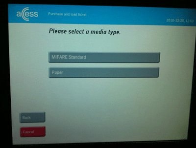
The screen that made me shake my head, and inspired this blog post, was the “Select media type” screen that contained the phrase “MIFARE standard” as an option. Media type? MIFARE standard? We opted for “Paper” by deduction as Back, Cancel, and the mysterious MIFARE didn’t seem like the right options. So Paper it had to be.
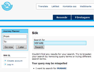
But what is MIFARE you ask? A search on SL’s website is no help whatsoever. The term MIFARE isn’t used at all on the entire site. As usual, Google will give you the answer – it’s the contactless technology used in SL’s “Access” smart cards and billions of other smart cards around the world.

Access is the sub-brand created by SL for their smart cards, which given that they have bothered to create a sub-brand, would have been a more sensible option to display on this screen. People just aren’t going to understand what MIFARE Standard is. Not that it will help you, but MIFARE Standard isn’t even the the technology used, it’s actually MIFARE Classic.
Complete lacking of testing
Sadly, despite my ranting above about plain english and sub-branding, I think in this case the problem is down to a complete lack of testing of the Englsh language version. The Swedish version perhaps may not have been tested with real users either, but it does use more sensible language – and in particular doesn’t include the mysterious MIFARE option.
SL introduced a 20kr fee for “Access” smart cards from the 1st of January in an attempt to encourage Stockholmers to reuse and refill their cards more often. Perhaps it would have been more sensible to invest a little more in testing the process and making it a bit more user friendly instead?
