Transitions and Animations and All That Jazz

How to we successfully design and implement movement into our websites and digital products?
Today I’ve been fortunate enough to have a design problem on my to do list. I need to work out how to visualise that something triggered by the user is ongoing.
This means I had a legitimate reason to dig around into transitions and animations and think about how they work and could be applied to this particular conundrum.
Then I stumbled on this.
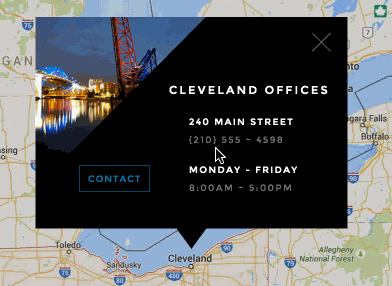
It’s an example of “morphing” designed and coded by Sarah Drasner and featured in her article The Importance of Context-Shifting in UX Patterns.
I watched it loop.
I watched it again and again.
There’s so much interesting detail going on here. Go ahead and play with it yourself using this demo on codepen.
Let me break it down
Let’s look at what is happening, step for step
- The contact button has a hover effect, giving the button a blue transparency when you go to press it.
- The word “contact” from the contact button animates across to form the title of the contact form when the button has been clicked.
- The contact details (name, address and phone number) fade away once the contact button is clicked, replaced by the contact form.
- The word “email” from the email button moves across to become the title of the input field when the email button is clicked.
- When the submit button is pressed, the email field and the submit button transform into two circles and the title of the form fades away.
- The two circles then alternate their position with an animation. This forms a “spinner” to indicate that we are waiting.
- The two circles eventually stop at a point when they are on top of each other. The circle then moves, enlarges and changes colour from blue to green coming to rest at a higher, centralised point.
- The green circle then shrinks back in size a little before a white tick appears inside it along with the “send successfully” confirmation text.
- Pressing the x icon then causes a “fade, fold & close” effect to tidy up and remove the box.
Beautiful.
It includes a lots of visual cues to guide us through the process. These clues make the process of filling in this contact form more fluid, perhaps even creating more satisfaction and giving it a more natural feel.
By natural feel I mean that elements on the screen transition between positions in a way that mimics printed paper being physically moved. A concept that lies at the heart of Google’s Material Design — where the physical properties of paper are transferred to the screen.
Sarah gives these placement changing interactions the name – context-shifting UX.
Reality strikes
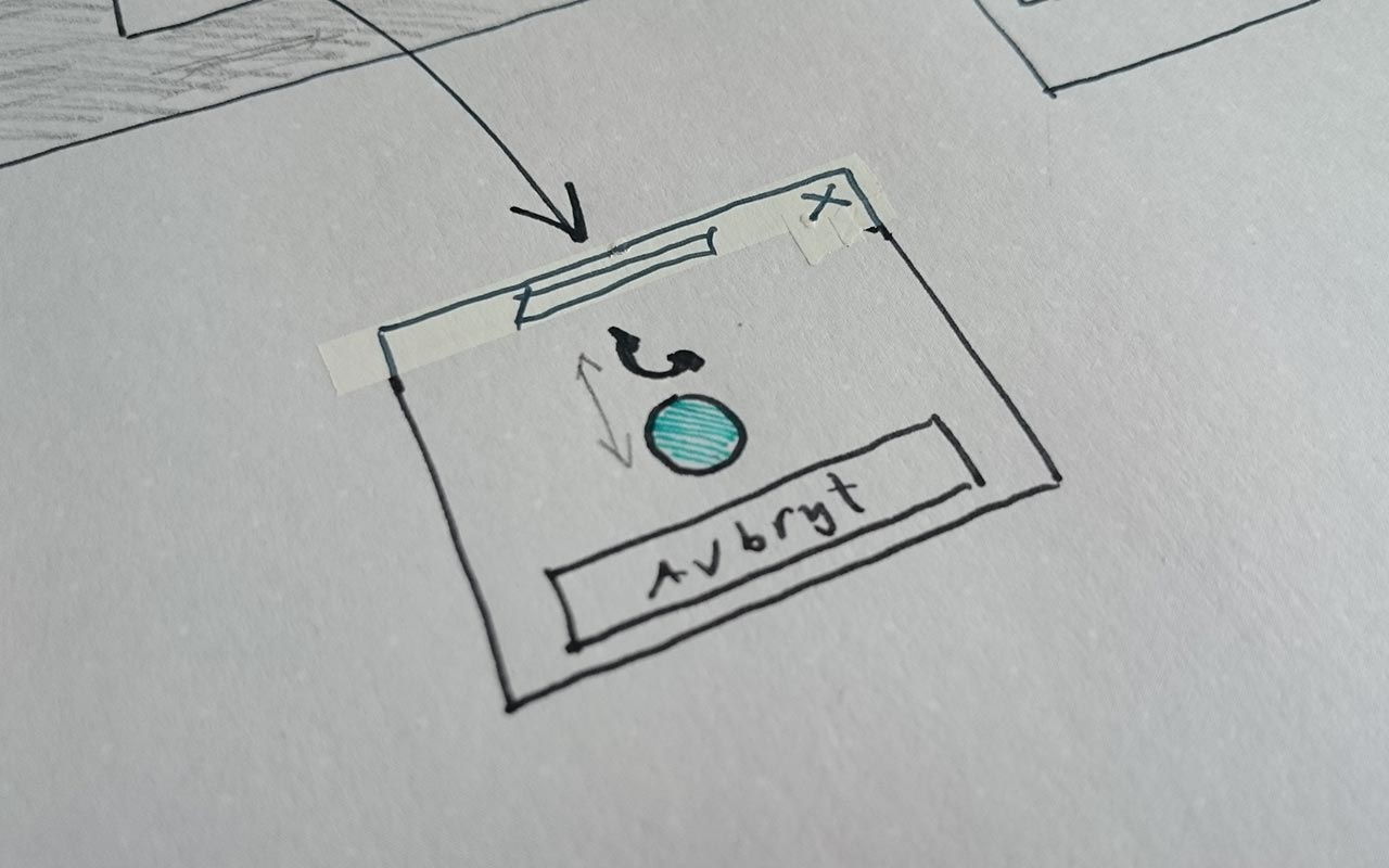
After being inspired by my little bit of research, I started sketching some solutions for my design problem.
At this point, I’m still a bit excited by the possibilities and the ideas I have in my head. Web animation has in recent times become easier to achieve than ever before. It’s the future!
Soon though I crashed back down to earth.
I started to think beyond my sketching here and now and consider the implications; did we have enough time to implement this kind of solution? What kind of impact would it have on other parts the product? Is it worth it? Would the rest of the team buy into it?
What is needed for this kind of attention to the user experience, for context-shifting UX, to make it into the end product?
It requires a magical convergence of several disciplines (you can read that as collaboration if you will) and effective communication with key stakeholders.
That shouldn’t be a surprise. Heck, we know that collaboration and communication are key ingredients for successful products and websites.
But in reality this translates to the following
- A UX designer (or whatever label you want to give to the person who is charged with combining research with interaction design and producing some kind of artefact that can be translated via visual design into, well, code) who has the wherewithal to move beyond static wireframes.
- A product manager (or whatever label you want to give to the project manager, channel owner, or client who is your main connection with the rest of the organisation) who has an optimal balance of understanding between the user experience, the limitations and possibilities of the target technology, and the business. They will have also understood that the experience really is part of the product (and the branding) and not just a deliverable as part of a item in the backlog.
- A coder (or whatever label you want to give to the person who actually commits code, writes lines in programming and mark-up languages that actually translates your ideas and designs into something that exists) that can listen, understand, and appreciate what you are trying to achieve.
- Users (or whatever label you want to give to the people who will actually end up using your product or website) that you can talk to and test with. This gives you the data you need to show that the attention to detail. users of your product
- An organisation that trusts you to deliver.
Reality strikes twice
What I fear is that often we have to deal with the opposite.
Where you aren’t trusted by the organisation to deliver.
You are expected to deliver a wireframe or an interaction flow.
Your product management only care about shipping a feature as marketing announced it with a fanfare in Q1 and sales have been promising it since you were in Q3 the year before.
Testing with real users is that thing you read about that everyone else does.
And your coders just want to get through this sprint and get home to work on their side-project. The one that’ll make them rich.
What do we do?
I was going to bottle out of providing you with an answer, and leave you to puzzle it out for yourself. But instead here are some concrete steps to take:
- Pair up with your creative partners (coder, visual designer, UX-er), think about what you need in order to move forward. Cut out unnecessary steps. Work out what tools would be best for all of you. Animations and transitions are tough to communicate on paper and time consuming to recreate using design tools. Create prototypes as quickly as possible, and transfer time saved adding details to static design comps, to adding details and finesses to a live prototype. Read: Responsive Design Workflow by Stephen Hay.
- Always understand who is the target audience for what you are designing. It’s rarely the end-user directly. More often it is your creative partner, product manager or stake-holders. Learn to communicate your thoughts and designs to those who will receive them. Read: Articulating Design Decisions by Tom Greever.
- Get stuff out there and test it. It’s always possible to do some kind of testing, observations or interviews. Prototyping allows you to get out there quicker. Tools such as Hotjar let you gather data and ask questions to those who get the chance to experience or test your work. Read: Guerrilla testing from UK government’s service design manual and Quick and Dirty Remote User Testing by Nate Bolt.
- Work out how you can measure the value of what you have done. You can even try to measure delight. Measuring sentiment and emotion, such as delight, isn’t quite as straight-forward as measuring conversions or sales, but it can be done. You could ask users to give your product/feature/widget a Net Promoter Score — or perhaps look into other ways of measuring satisfaction. Read: Measuring Business’s New Bottom Line: Customer Delight a series of articles by Steve Denning.
As a bonus step, you could dig a little deeper into the functional benefits of animations and transitions to help ground your designs more firmly. Read: Functional Animation In UX Design by Amit Daliot.
Hopefully you are now a little better prepared to make sure those wonderfully crafted micro-interactions get created and make it through to the end product.
Stick with it!