Did the mobile web reach tipping point?
A year ago I said that 2010 would be the year that the mobile web reached tipping point. The question is, did it?
There are many ways you could measure it and we could argue all day about what is the best way to measure it. Mobile page views? smartphone devices sold? Mobile web bandwidth use?
Visits and Pageviews
I’m going to use figures for pageviews and visits from a client’s website in this article to help illustrate how much mobile web use has grown in 2010. I’m going to leave the site anonymous, but I will give you a few background details.
The site is based in Sweden and it’s visits are predominately from the Stockholm area. It’s visited by a full cross-section of Internet users from all generations. There is no mobile adjusted site available – all visitors use the same, full, desktop version. The number of pageviews a month is around 45,000.
600% increase

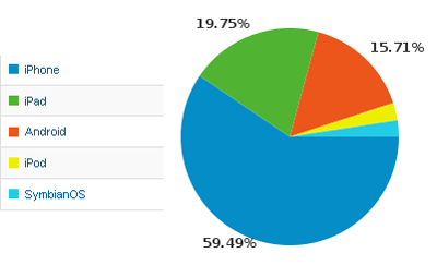
Up to November 2009 the site had received no visits from mobile devices. In the three months from December 2009 to February 2010 this increased to 1.7% of visits. In December 2009 only 1.1% of pageviews were served to mobiles with most being to iPhones. (Note that I’m including the following devices in the statistics for “mobiles”: iPad, iPod, iPhone, Android, Symbian).
In December 2010, this figure had increased to 6.5% of page views and 8.5% of visits. The iPhone still dominates, with the iPad and Android devices sitting pretty and fighting over 2nd place.

Tipping point reached
The tipping point for this web site came at the end of July 2010. The end of July saw the launch of the iPhone 4 here in Sweden. Once people returned to work after the traditional summer break the number of pageviews served to mobile devices pretty much doubled and hasn’t looked back since.
It would also appear that plenty of people got an iThing for Christmas judging by the spike of pageviews since then. It is, of course, too early to know for sure if this new doubling of mobile visits will be sustained, but so far it hasn’t dropped back.
Bear in mind that all of these figures are for a website that has made no attempt to attract mobile and handheld visitors, and has made no adjustments to cater for them either. These visitors are the people who are deciding to use the site regardless of the limitations – presumably because accessing websites via their handheld device has become a standard form of behaviour for them.
As big as Chrome
Given that the total number of mobile pageviews is over three times as many as for IE6, and pretty much the same percentage as pageviews served to visitors using Google’s Chrome browser – It’s crucial that you regularly check your website on mobile and handheld devices.
You need to check your site regularly, not only during development development or design projects. Just as it has been standard practice for many years to check a range of web browsers, it is now standard practice to check a range of handheld devices too.
